|
To view a trade plot and access all the trade analysis features, right-click on a test in a Results Window and select Show Trade Plots.
.png)
The type of plot shown will be whichever type you last viewed.
A tab bar across the top of every plot window shows the available plot types; clicking a tab is the quickest way to switch the display. (The Plot Type list in the options dialog and the keyboard shortcuts do the same thing.)
When the test contains more than one strategy, a strategy list is docked to the left of the plot. Exactly one strategy is always selected; clicking a name (or pressing that strategy’s number key, 1-9) switches the plot to that strategy’s trades. Toggle the panel with the P key, the Show Strategy Panel item on the Plot menu, or the "Show Strategies as Side Panel" checkbox in the options dialog, and drag the divider between the panel and the plot to adjust its width. Copied and saved images exclude the tab bar and the panel.
Once a plot window is open, right-click and select Options (or press the O key):
.png)
This dialog serves as the control panel for the plot window. It stays open while you use the plot window, making it easy to quickly try the different plot types and options.
Strategy selects the strategy or statsgroup for which to plot the trades (equivalent to the side panel described above).
Plot Type selects the type of plot to display (the same choices as the tab bar):
.png)
Each plot type is described below.
Trade Value selects the units to display on the Y-axis:
.png)
Choices are: dollar profit, percent gain on position size, or percent gain on equity allocation.
Sort By specifies the units of the X-axis:
.png)
Trade Number plots the trades in the order they were entered. Formula sorts the trades by the value of the Formula field (described below), with the X axis scaled by that value. Percentile uses the same formula sort, but places each trade at its rank percentile (0 to 100) rather than at its formula value, spreading the trades evenly along the X axis. This is useful when a few outliers would otherwise compress most of the plot into a narrow band. In the Equal Range Bins plot type, the bins themselves remain value-based and only the bin boundary labels are converted to percentiles.
Min Value and Max Value make it possible to filter outliers that might distort the plot.
Monte Carlo Samples and Show Best/Worst are options for the Monte Carlo plots which are described below.
Distribution Bins, Equal Count Bins and Equal Range Increment are options for those plot types, also described below.
Show Cross-Hair, Show Linear Regression Trend Line, and Log Analysis Stats are additional display and output options.
Notice that some of these items have keyboard shortcuts shown next to them. Pressing that key when the plot window is active is equivalent to selecting the item in the options dialog.
Formula is a miniature script editor where you can type any formula expression from the RealTest Script Language. The context of evaluation for the formula is the "setup bar" of each trade, i.e. the latest available bar at the time it was decided to enter the position. This makes it possible to quickly sort a trade plot by a variety of "entry factors" to visually assess whether each factor has "an edge". This will be demonstrated below.
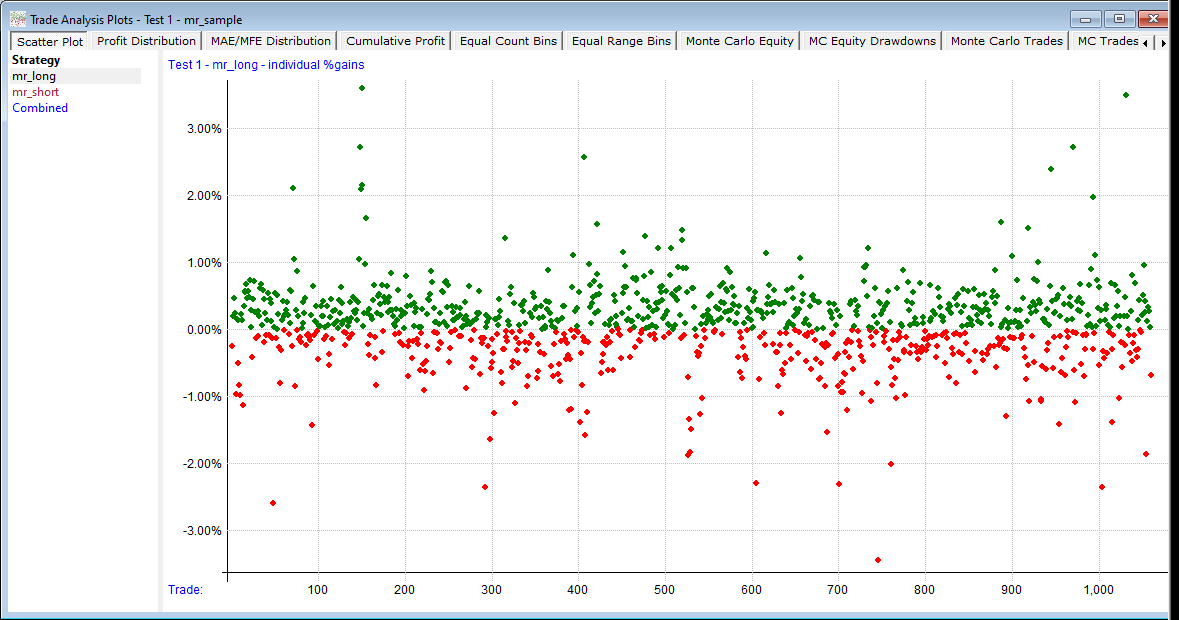
The simplest kind of trade plot is the Scatter Plot:
.png)
This gives a feel for the general distribution of trade results.
Here we've changed the plot to the mr_short strategy and sorted the results by the C / EMA(C, 5) formula:
.png)
The upward slope of the linear regression line clearly shows that the more "overbought" the stock was prior to entry, the higher the expectancy of the trade. This is a real edge.
Profit Distribution plots a horizontal line for each range of % gains, something like a sideways "bell curve". If a strategy has "fat tails" they'll be visible on this plot (this one has the wide, thin tails typical of short-term mean reversion systems).
.png)
MAE/MFE Distribution is similar to the above, but rather than plotting closed-trade gains, it plots maximum open-position drawdowns and run-ups, also known as "adverse and favorable excursions".
.png)
The number of distribution bins to use in the above two plot types can be specified in the plot options dialog.
Cumulative Profit is similar to a typical equity curve, but is derived from individual trades rather than daily net change of equity. Green dots show new highs of the profit line.
.png)
Equal Count Bins is a plot type designed for quick visual analysis of potential setup-day edge factors.
Here is an example using the same C / EMA(C, 5) formula as in the sorted scatter plot above:
.png)
Use the Equal Count Bins field in the Plot Options dialog to specify how many bins to use.
If Log Analysis Stats is checked when this plot is opened or refreshed, it will provide output like this:
.png)
Equal Range Bins uses the same concept as the above, but the bin contents are determined by value range rather than count.
Here's the same formula plotted with a bin for every 0.02 increment of the formula value:
.png)
Here are the stats for that plot:
.png)
The last four plot types are the Monte Carlo Analysis plots.
The idea here is to randomly re-order either the individual trades or the daily percent changes in account value many times to see what the possible range of outcome might have been. RealTest uses "random selection with replacement".
Imagine putting each trade or account change value in a bucket. Pick one, record it as the first value, put it back, shuffle the bucket. Then pick the second value, put it back, shuffle the bucket, and so on. Continue until you've picked the same number of values (trades or stat periods) as the test had.
Repeat that entire process hundreds or even thousands of times. Plot the best and worst curves that emerge, along with the original backtest curve.
Here's an example from the mr_sample backtest showing randomized daily equity changes:
.png)
Keep in mind that every time you refresh this plot, it will look different, because a new set of random values are selected.
Here is the log output for Monte Carlo analysis:
.png)
Here is an example of a Monte Carlo equity drawdowns plot:
.png)
Again, this is not the same set of randomized equity curves as the first plot above -- every time a plot is drawn or refreshed the randomization is recalculated.
This plot looks alarming but remember that these are the worst 5 drawdowns from 100 randomizations of the daily results, so while it's certainly possible to have a 45% drawdown in this mean-reversion strategy, it's not highly probable.
|